Differential expression analysis tells us which genes change between two conditions, but a list of genes is rarely enough on its own. Individual genes are noisy and hard to interpret without a broader framework.
Gene set enrichment analysis asks a different question: are the genes belonging to a known pathway systematically shifted toward the top or bottom of a genome-wide ranked list? This matters because many real biological processes involve coordinated but moderate changes across hundreds of genes rather than a few dramatic ones — exactly the pattern a significance threshold discards. This workflow runs RNA-seq differential expression results against four MSigDB collections using fgsea.
Why Not Just a Filtered Gene List?
Over-representation analysis starts by filtering, say to padj < 0.05 and |log2FC| > 1, then asks whether a pathway contains more of those genes than chance would predict. It has three weaknesses: it depends on an arbitrary cutoff (0.049 is in, 0.051 is out), it throws away ranking information entirely, and it favours large well-annotated pathways.
GSEA uses every gene that passes basic quality filtering. Each gene gets a ranking statistic and gene sets are tested for enrichment at the extremes of that ranking. Here the statistic is the stat column from DESeq2 — the Wald statistic — which is a good choice because it carries both effect size and uncertainty. Ranking by fold change alone over-prioritises noisy low-count genes; ranking by p-value alone loses direction.
Input and the Ranked Gene List
The workflow expects a tab-delimited differential expression table with gene, stat, log2FoldChange, and padj columns, and filters out rows with missing values in critical fields. The central object is the ranked vector:
gene_rank <- res_df$stat
names(gene_rank) <- res_df$gene
gene_rank <- sort(gene_rank, decreasing = TRUE)
Genes at the top are most strongly associated with the test condition; genes at the bottom with the control.
Everything downstream depends on the direction of the original contrast. If the comparison is test_vs_control, a positive enrichment score means the pathway is enriched in the test condition. Run the contrast the other way and every interpretation inverts. This is not a labelling nicety — it can flip the biological conclusion completely, so state the contrast explicitly in any report.
Before trusting pathway results, sanity-check the input: print the gene count and the top up- and downregulated genes. If known markers point the wrong way, stop there.
MSigDB Collections
The workflow uses msigdbr to pull four collections, each a different kind of biological knowledge:
| Collection | Contents | Best used for |
|---|---|---|
| Hallmark | Compact, curated sets for major processes (EMT, hypoxia, interferon response, cell cycle) | First-pass interpretation — minimal redundancy, cleanest view of dominant programs |
| C2 | Curated pathways from KEGG, Reactome, BioCarta | Mechanistic detail; more granular but often redundant across sources |
| C3 | Transcription factor and microRNA target signatures | Hypotheses about upstream regulators |
| C5 | Gene Ontology terms (BP, MF, CC) | Broad themes; heavily overlapping, needs summarising |
Two cautions. C3 enrichment does not demonstrate transcription factor activity — it generates a hypothesis to be checked against regulator expression, motif enrichment, chromatin data, or perturbation. And reporting a long table of significant GO terms is weak analysis; redundant terms should be grouped into higher-level themes.
Preparing Gene Sets for fgsea
msigdbr returns one row per gene-to-set membership. fgsea wants a named list of gene vectors, so the table is grouped and collapsed:
gene_sets <- msigdb_data %>%
  dplyr::group_by(gs_name) %>%
  dplyr::summarize(genes = list(gene_symbol), .groups = "drop") %>%
  tibble::deframe()
One gotcha worth fixing: deframe() lives in tibble. Calling it unqualified without loading the package fails with could not find function "deframe". Namespacing it, as above, makes the dependency explicit.
Running GSEA
GSEA runs separately per collection:
fgsea(
  pathways = hallmark_sets,
  stats    = gene_rank,
  minSize  = 5,
  maxSize  = 500,
  eps      = 0
)
minSize and maxSize exclude sets that are too small to be stable or too broad to interpret. eps = 0 requests more accurate p-value estimation instead of stopping at a lower bound, at some cost in runtime.
Each result gives pathway, pval, padj, ES, NES, size, and leadingEdge. The normalized enrichment score is the most interpretable effect-size metric: positive means enrichment toward the top of the ranking, negative toward the bottom. Sets with padj < 0.05 are treated as significant.
What the Plots Show
Hallmark — NES bar plot
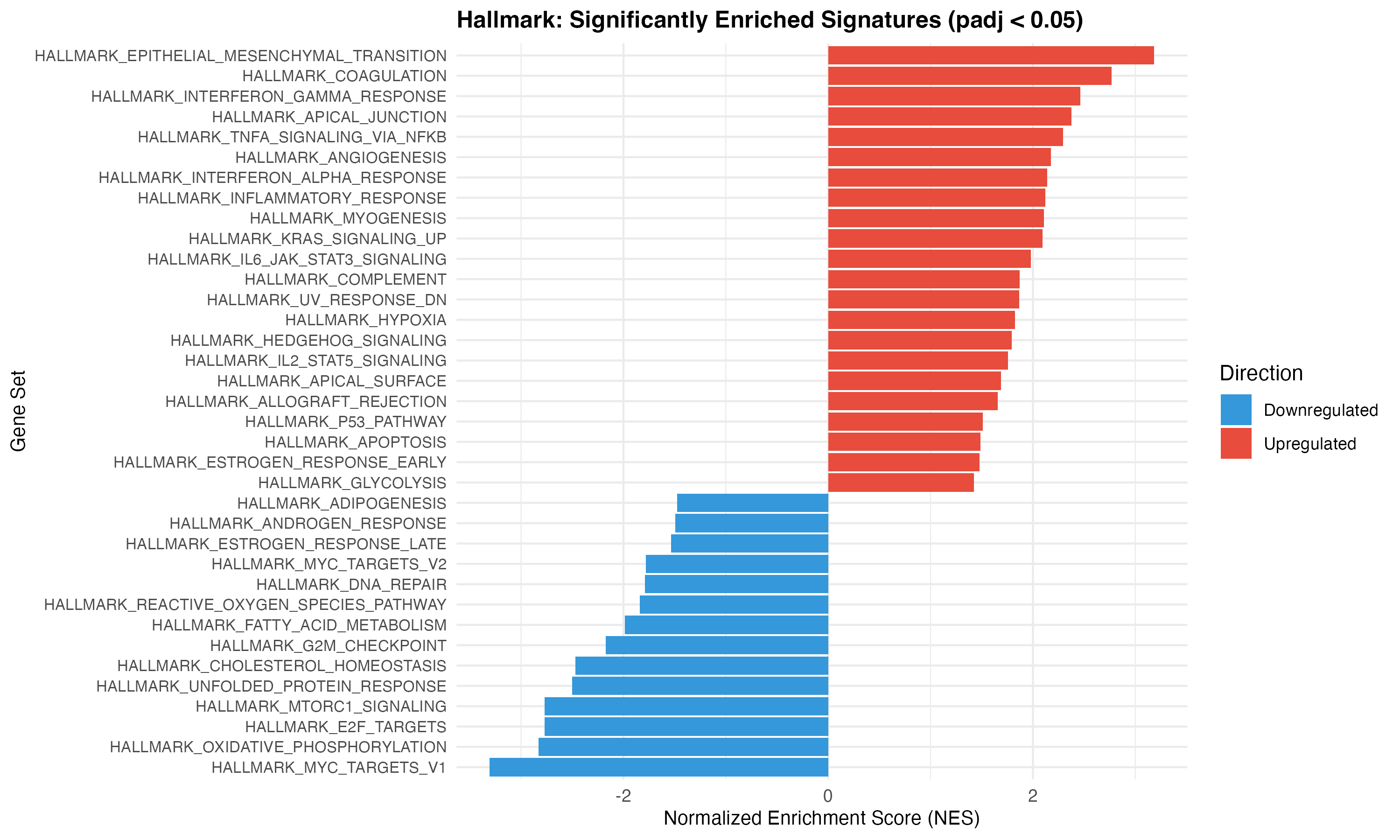
Significant Hallmark signatures ordered by NES, red for upregulated and blue for downregulated. A quick read on whether the dominant programs move up, down, or both.
Hallmark — NES vs significance
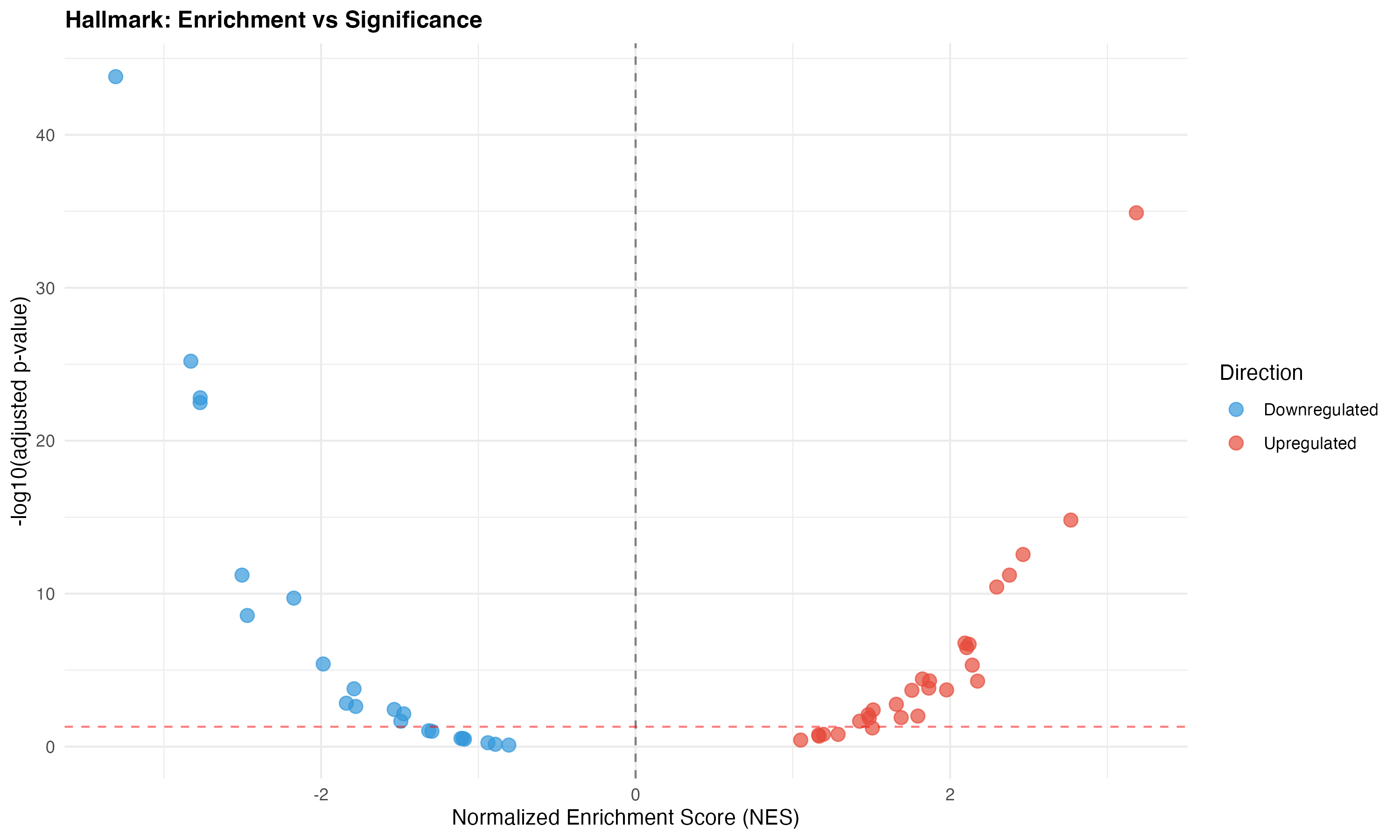
NES against -log10(padj), which separates effect direction from strength of evidence. Dot size is gene set size.
C2 and C3 — top results
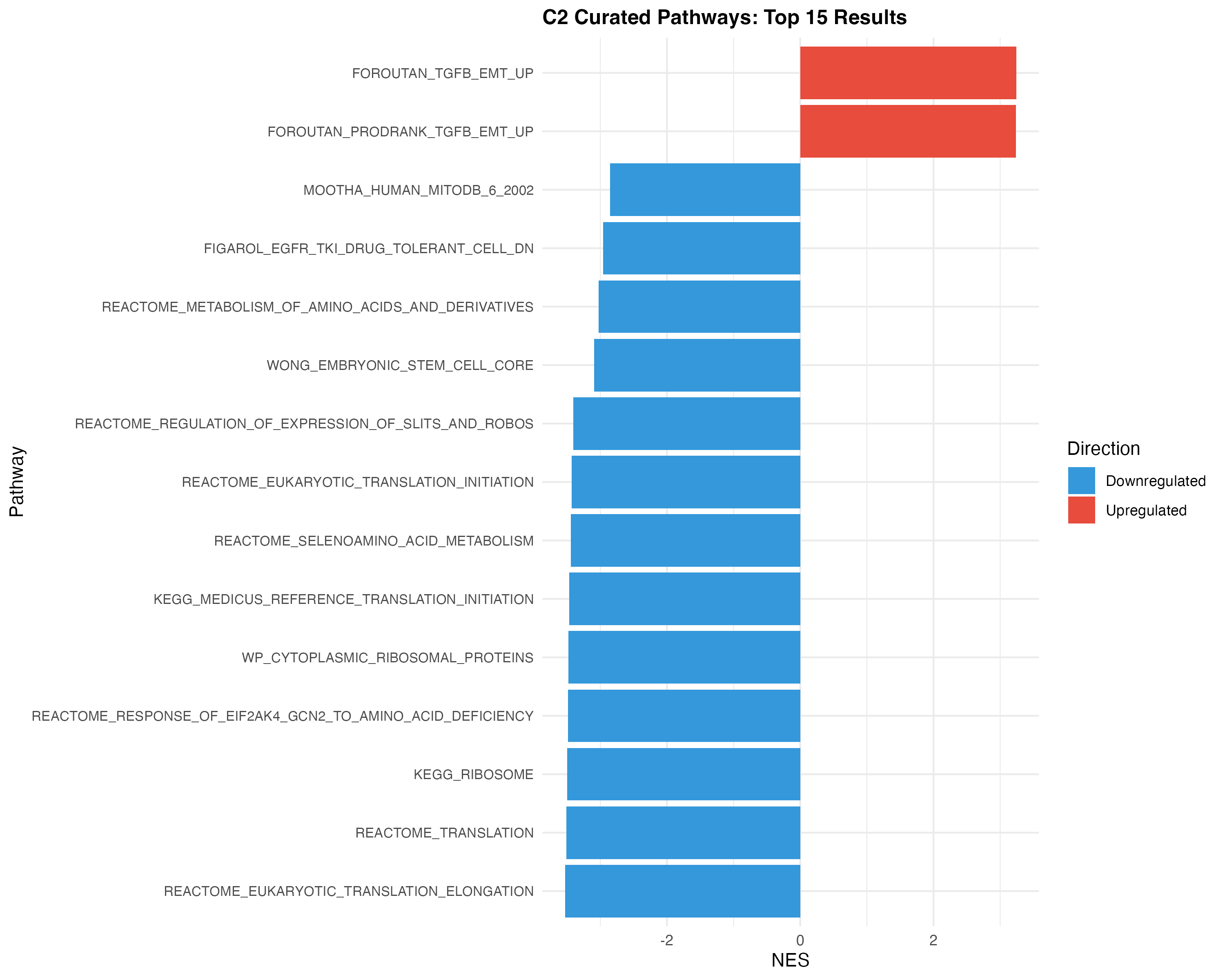
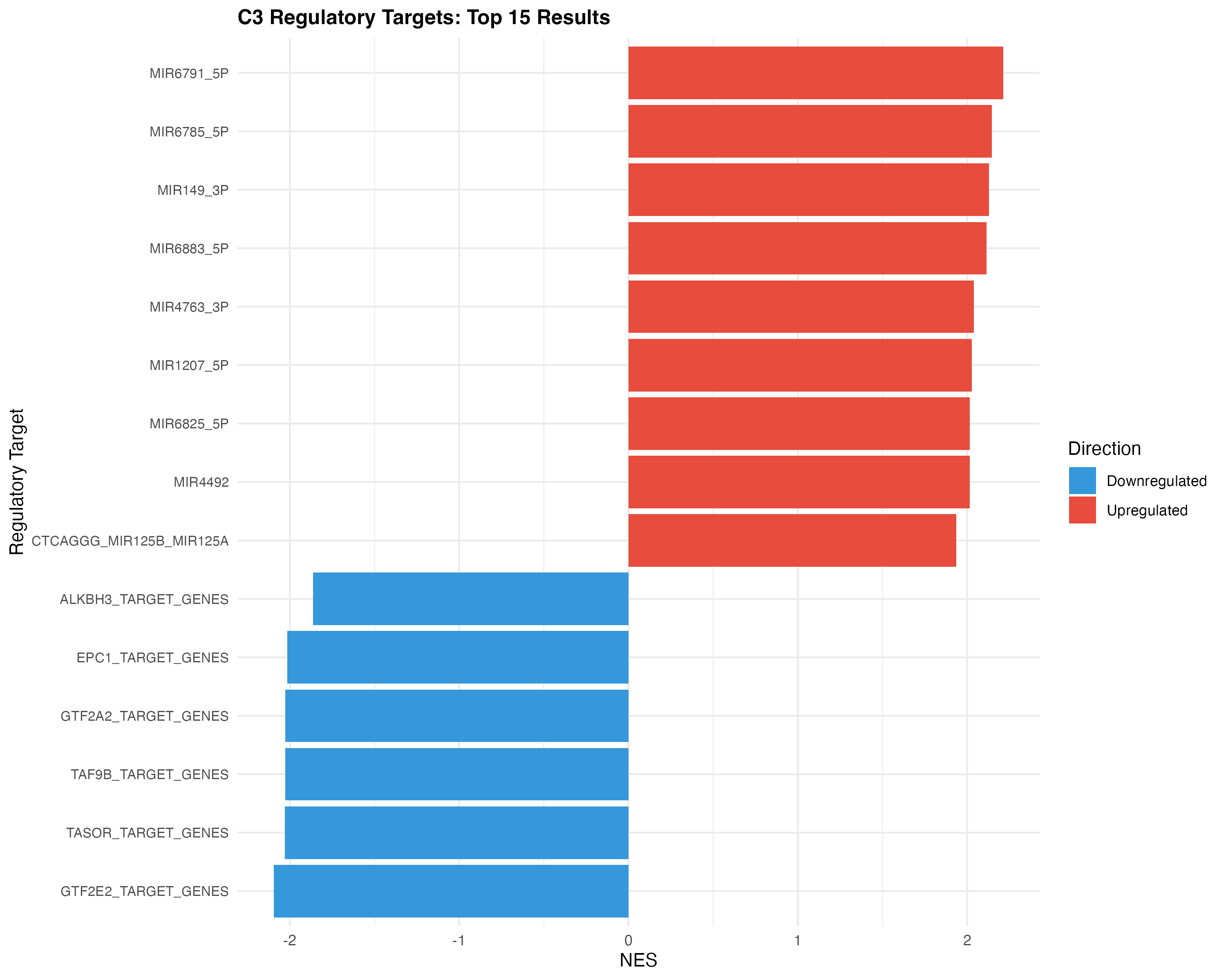
Top significant curated pathways and regulatory target signatures, for mechanistic follow-up once the Hallmark picture is clear.
Enrichment score curves
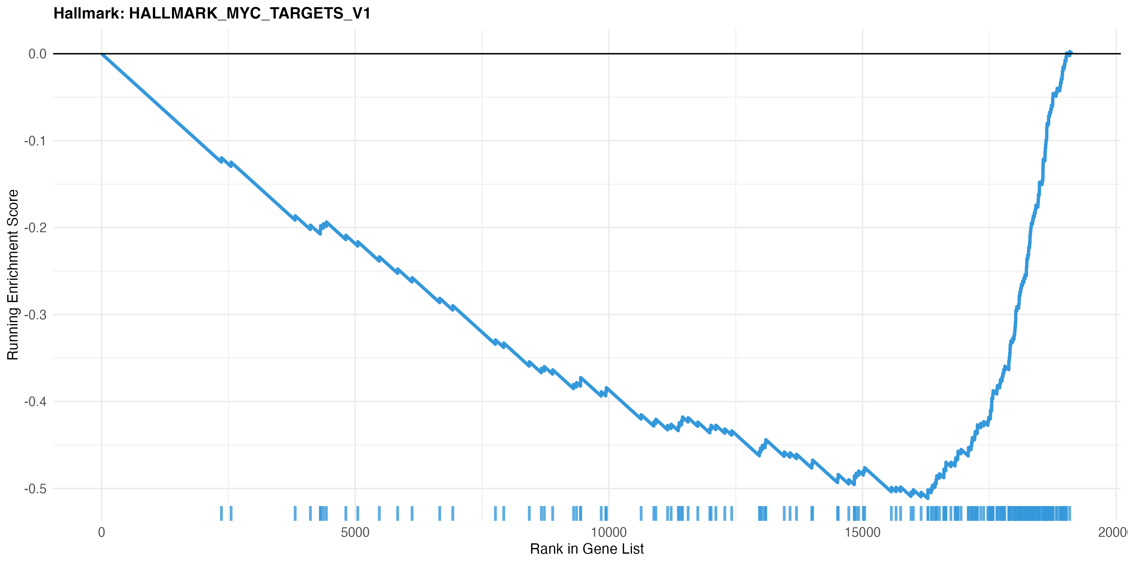
The top Hallmark pathway is HALLMARK_MYC_TARGETS_V1. The running score falls steadily to about -0.52 near rank 16,000, so MYC target genes sit toward the downregulated end. Tick marks show where the set’s genes fall in the ranking.
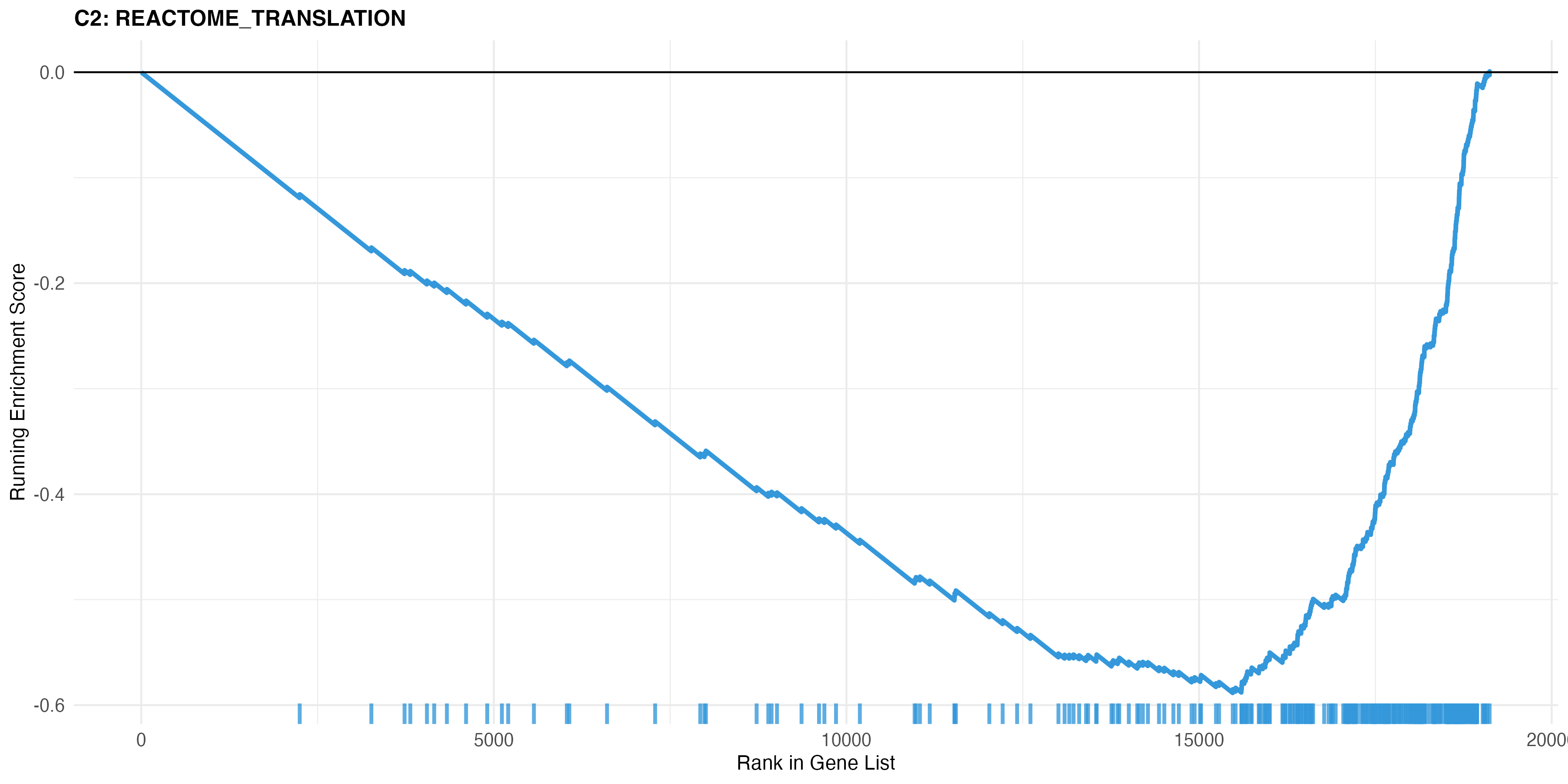
REACTOME_TRANSLATION, negatively enriched, minimum near -0.60 around rank 15,500. The ticks carry the story: translation genes are sparse at the upregulated end and dense past rank 16,000 — a coordinated shift across the whole set rather than a few outliers, which is precisely what threshold-based testing misses.
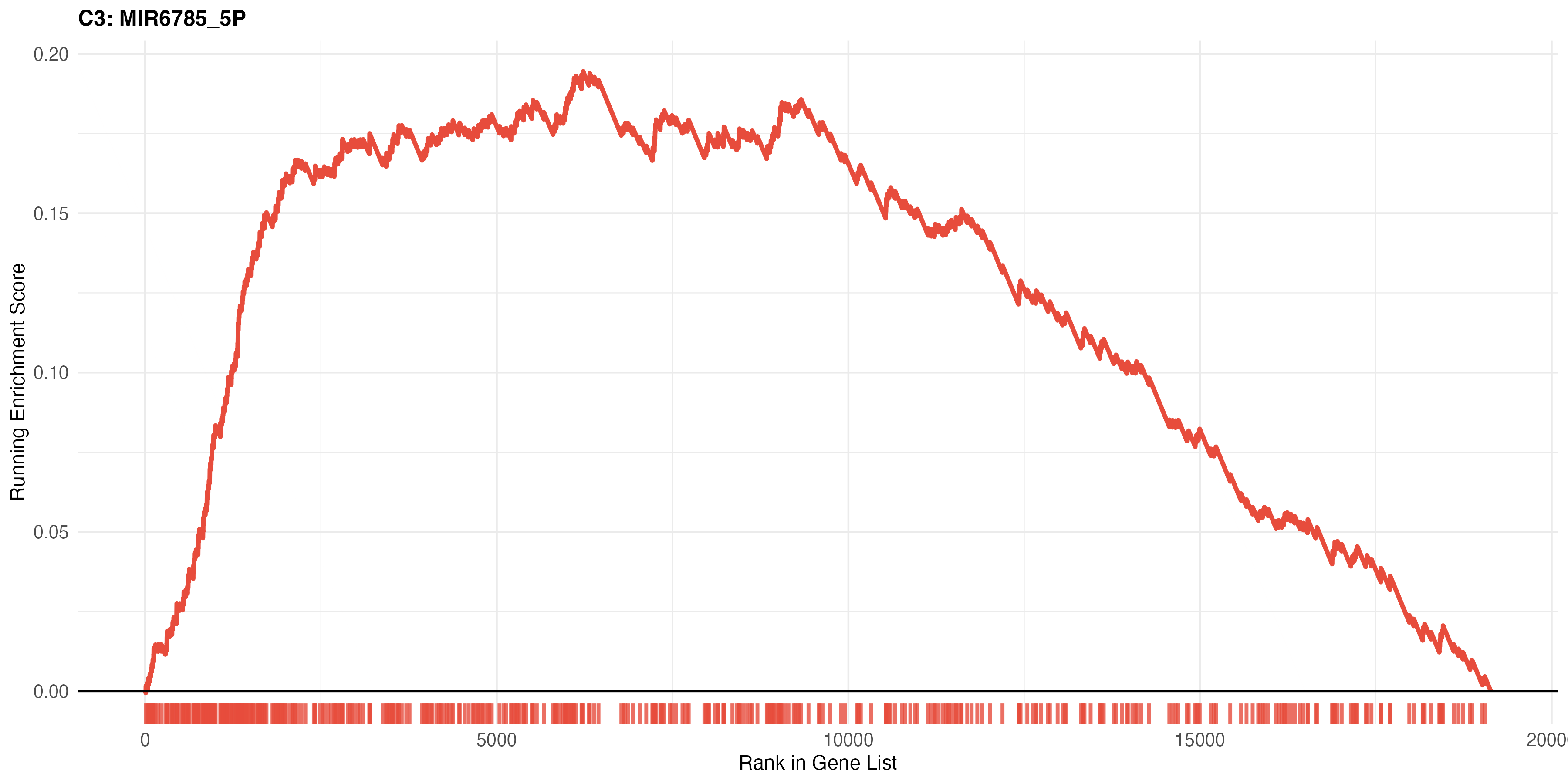
MIR6785_5P, worth contrasting with the others. The score is positive but weak, peaking near 0.19, and the ticks are spread almost uniformly across the ranking instead of concentrating at either end. This is what a large, diffuse set looks like when it reaches significance without a compelling directional signal — a reminder to read the curve, not just the adjusted p-value.
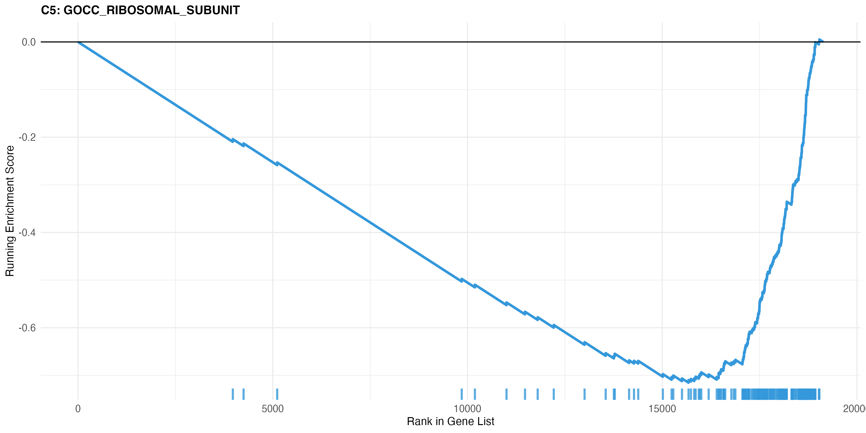
GOCC_RIBOSOMAL_SUBUNIT, the strongest of the four at about -0.72, and closely mirroring the C2 translation curve in both shape and trough position.
Read together, the curves make a coherent case: MYC targets down, translation down, ribosomal subunit down, all troughing in the same region of the ranking. That agreement is biologically sensible, since MYC directly drives ribosome biogenesis and translational capacity. Three collections describing one program at different resolutions is a far stronger result than any single striking curve — and the weak, diffuse C3 signature from the same run shows why the cross-collection check is worth doing.
Visualization is not interpretation, though. Significant pathways still have to make sense given the model system, tissue, treatment, and experimental design.
Leading Edge Genes
The leading edge is the subset of genes driving the enrichment score, and it is where superficial pathway interpretation gets caught. Two pathways can share an NES but be driven by entirely different genes; conversely, several apparently distinct enriched pathways often share the same leading edge. If multiple immune pathways are significant on the same handful of genes, that is one infiltration program, not several independent mechanisms.
Quality Control
GSEA is only as good as the ranked list and the annotation behind it. The recurring failure modes:
- Identifier mismatch — this workflow assumes human gene symbols on both sides. Ensembl IDs, outdated symbols, or mouse genes give poor or misleading overlap.
- Duplicate symbols — GSEA needs one statistic per gene. Resolve duplicates deliberately, for example by keeping the strongest absolute statistic.
- Contrast direction — mislabel it and every up/down call inverts.
- Confounding — if batch, sex, donor, or run are not modelled in the differential expression step, GSEA will happily enrich technical artifacts.
- Redundancy — C2 and C5 produce many overlapping terms. Collapse them into themes.
- Version drift — MSigDB and gene symbols change. Record MSigDB version, package versions, R version, and the exact contrast.
Before Production Use
The script as written is a solid first-pass layer: it uses all genes, ranks by the signed statistic, covers four collections, and exports both tables and plots. A few changes would make it reproducible enough for production:
- Move package installation out of the analysis script into
renv, Conda, or a container. - Record package and MSigDB versions alongside the results.
- Check for duplicate gene names before building the ranked vector, and report per-collection gene overlap.
- Export leading-edge genes, not only pathway-level summaries.
- Handle the empty case — plotting after filtering to
padj < 0.05can fail outright when nothing is significant.
Results are exported per collection as CSVs (Hallmark, C2_CuratedPathways, C3_RegulatoryTargets, C5_GeneOntology) plus a summary counting significant sets per collection and direction.
Interpretation Order
- Confirm the contrast is what you think it is.
- Read Hallmark for broad programs.
- Refine with C2 curated pathways.
- Use C3 to generate upstream regulator hypotheses.
- Support themes with C5, without over-reading redundant terms.
- Inspect leading-edge genes across the top pathways.
- Connect back to the experimental system, phenotype, and metadata.
This ordering guards against the most common mistake — treating a pathway name as a conclusion. An enrichment result is evidence that a defined gene set is non-randomly distributed in a ranked profile. It is not a mechanism, and mechanistic claims need more support.
Conclusion
Ranking all genes by the signed differential expression statistic and testing curated MSigDB sets with fgsea detects coordinated programs that threshold-based gene list methods miss. Start with Hallmark, then go deeper with curated pathways, regulatory signatures, and GO terms.
Used carefully, this turns a flat differential expression table into a structured biological narrative. Used carelessly, it produces attractive plots with misleading interpretation. The difference is disciplined ranking, annotation control, reproducible execution, and honest review of contrast direction and leading-edge genes.
Additional Resources
- Complete Analysis Code: GSEA-MSigDB GitHub Repository
- MSigDB Collections: MSigDB Documentation
- fgsea Package: fgsea Documentation on Bioconductor
- clusterProfiler Package: clusterProfiler Documentation